Version 8 to 9
This migration guide contains migration instructions for:
- eightshift/boilerplate - 8+ --> 9.0.0
- eightshift/frontend-libs - 7+ --> 8.0.0
- eightshift/libs - 6.4.0
Required changes
Migration time: ~45min to a couple of hours, depending on project size and components used.
- Update
composerpackages and check if Eightshift Libs are on version 6.4 (or higher) - Update
@eightshift/frontend-libsin yourpackage.jsonfile to the latest version:"@eightshift/frontend-libs": "^8.0.0", - Important: Delete your lockfile (
package.lock) and yournode_modulesfolder, then runnpm install - Rename updated components, update changed properties and replace deprecated components (see chapter below)
- Do a
npm start, check that you have no build errors visible - Smoke test your blocks - to verify everything was migrated properly, go through all the blocks and check if everything looks good visually and that everything is functional
Component updates and replacements
Below you will find some of the more common components that will need to be modified, and also some possible caveats.
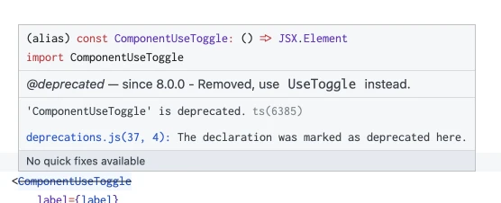
Your code editor should mark the components that need replacement with a strikethrough over the component name:
Common between components
- if you have a label with an
IconLabelinside, you can migrate it to separateiconandlabelprops:becomeslabel={<IconLabel icon={icons.color} label={__('Background', 'domain')} />}icon={icons.color}label={__('Background', 'domain')} - if the component is the last in the list of options, you can add
noBottomSpacingto make everything look a bit nicer - if you want to visually group two similar components, e.g. toggles, you can bring them vertically closer together with
reducedBottomSpacing
CollapsableComponentUseToggle
- rename the component and imports to
UseToggle - change
showUseToggletonoUseToggleand flip its logic - change
showLabeltonoLabeland flip its logic - change
showExpanderButtontonoExpandButtonand flip its logic - consider adding
noExpandButtonto your attributes and add it to all your blocks, so the options render nicely
ComponentUseToggle
- replace the component with
UseToggle - move all of the options inside the useToggle
- change
showUseToggletonoUseToggleand flip its logic - change
showLabeltonoLabeland flip its logic
Example
Before
<ComponentUseToggle
	label={label}
	checked={accordionUse}
	onChange={(value) => setAttributes({ [getAttrKey('accordionUse', attributes, manifest)]: value })}
	showUseToggle={showAccordionUse}
	showLabel={showLabel}
/>

{accordionUse &&
	// Other options.
}
After:
<UseToggle
	label={label}
	checked={accordionUse}
	onChange={(value) => setAttributes({ [getAttrKey('accordionUse', attributes, manifest)]: value })}
	noUseToggle={!showAccordionUse} // Inverted logic!
	noLabel={!showLabel} // Inverted logic!
	noBottomSpacing // If the component is the only one in the options panel
>
	// Other options.
</UseToggle>
ColorPaletteCustom
- rename the component and imports to
ColorPalette - remove the
inlineprop if you have it added - change the
layoutprop to a string instead of aColorPaletteCustomLayoutobject (hint: use autocomplete to see all the possible values) - if you have it set, change
groupShades={false}tonoShadeGrouping
ColorPickerComponent
- rename the component and imports to
ColorPicker - change the
typeprop to a string instead of aColorPickerTypeobject (hint: use autocomplete to see all the possible values) - if you have it set, change
groupShades={false}tonoShadeGrouping - if you have it set, replace
includeWpBottomSpacing={false}withnoBottomSpacing
Responsive
- check and remove all breakpoint labels you had set manually, they're now automatically rendered by the component
CompactResponsive
- rename the component and imports to
Responsive - check and remove all breakpoint labels you had set manually, they're now automatically rendered by the component
CustomSelect
- this component has been split up into 4 more specific components
- if you had a CustomSelect without
multipleand withoptions, replace it withSelect - if you had a CustomSelect without
multipleand withloadOptions, replace it withMultiSelect - if you had a CustomSelect with
multipleand withoptions, replace it withMultiSelect - if you had a CustomSelect with
multipleand withloadOptions, replace it withAsyncMultiSelect
- if you had a CustomSelect without
- replace
isClearablewithclearableif you had it set totrue - replace
isSearchablewithnoSearchif you had it set tofalse, otherwise remove it - remove
reFetchOnSearch, as it was removed - remove
multiple(make sure you add the proper kind of Select!) - if you had an async select (with
loadOptions), and hadsimpleValueset, you will need to find a slightly different solution, as this is not supported anymore
LinkEditComponent
- ⚠️ props have changed here, it'll leave URL pickers broken if you forget to change them!
- replace
setAttributes,urlAttrName,isNewTabAttrName(if set) with anonChangecallback (see example below) - remove
titlewithlabelif you want to keep it customized (you can also just remove it) - replace
showNewTabOptionwithhideOpensInNewTaband invert its logic - you can now hide the anchor notice with
hideAnchorNotice
Example
Before
url={buttonUrl}
<LinkEditComponent
	url={buttonUrl}
	opensInNewTab={buttonIsNewTab}
	setAttributes={setAttributes}
	title={variableLabel}
	urlAttrName={getAttrKey('buttonUrl', attributes, manifest)}
	isNewTabAttrName={getAttrKey('buttonIsNewTab', attributes, manifest)}
	showNewTabOption={showButtonIsNewTab}
/>
After
<LinkEditComponent
	url={buttonUrl}
	opensInNewTab={buttonIsNewTab}
	hideOpensInNewTab={!showButtonIsNewTab} // Inverted logic!
	onChange={({ url, newTab, isAnchor }) => setAttributes({
		[getAttrKey('buttonUrl', attributes, manifest)]: url,
		[getAttrKey('buttonIsNewTab', attributes, manifest)]: newTab,
		[getAttrKey('buttonIsAnchor', attributes, manifest)]: isAnchor ?? false, // Optional, can replace a manual toggle (detects setting anchor links automatically).
	})}
/>
SimpleVerticalSingleSelect
- replace the component with
OptionSelector - replace the
optionsprop (one that returns an object) withvalue,onChangecallback and availableoptions(array)
Example
Make sure your options have at least a label and a value!
Before
const sizeOptions = getOption('buttonSize', attributes, manifest).map(({ label, value, icon: iconName }) => {
		return {
			onClick: () => setAttributes({
				[getAttrKey('buttonSize', attributes, manifest)]: value,
				[getAttrKey('buttonIsLink', attributes, manifest)]: false
			}),
			label: label,
			isActive: buttonSize === value,
			icon: icons[iconName],
		};
	});

// ...

<SimpleVerticalSingleSelect
	label={<IconLabel icon={icons.size} label={__('Size', 'domain')} />}
	options={sizeOptions}
/>
After
<OptionSelector
	icon={icons.size}
	label={__('Size', 'domain')}
	options={getOption('buttonSize', attributes, manifest)}
	value={buttonSize}
	onChange={(value) => setAttributes({
		[getAttrKey('buttonSize', attributes, manifest)]: value,
		[getAttrKey('buttonIsLink', attributes, manifest)]: false
	})}
/>
OptionPicker
- replace with
OptionSelector - add
noBottomSpacingandborder='none' - add
additionalContainerClass='es-p-1.25'to align it properly with other controls - remove the
label
Consider relocating your toolbar option to the options sidebar.
LinkToolbarButton
- replace with
LinkEditComponent- follow the guide for that component for other prop replacements
- you might need to place it in a
Example
Before
<LinkToolbarButton
	urlAttrName={getAttrKey('chevronUrl', attributes, manifest)}
	isNewTabAttrName={getAttrKey('chevronIsNewTab', attributes, manifest)}
	url={chevronUrl}
	opensInNewTab={chevronIsNewTab}
	setAttributes={setAttributes}
	title={__(ucfirst(componentName), 'domain')}
/>
After
import { ToolbarButton, ToolbarItem, } from '@wordpress/components';
import { PopoverWithTrigger } from '@eightshift/frontend-libs/scripts';

// ...

<ToolbarItem as='div'>
	<PopoverWithTrigger
		position='top right'
		contentClass='es-w-80 es-p-4'
		trigger={
			({ ref, setIsOpen, isOpen }) => (
				<ToolbarButton
					ref={ref}
					onClick={() => setIsOpen(!isOpen)}
					isPressed={chevronUrl?.length > 0}
					icon={icons.link}
				/>
			)
		}
	>
		<LinkEditComponent
			url={chevronUrl}
			opensInNewTab={chevronIsNewTab}
			onChange={({ url, newTab }) => setAttributes({
				[getAttrKey('chevronUrl', attributes, manifest)]: url,
				[getAttrKey('chevronIsNewTab', attributes, manifest)]: newTab,
			})}
			hideOpensInNewTab
			noBottomSpacing
		/>
	</PopoverWithTrigger>
</ToolbarItem>
InlineNotification
- rename the component and imports to
Notification - change the
typeprop to a string instead of aInlineNotificationTypeobject (hint: use autocomplete to see all the possible values) - replace
removeBottomFieldSpacingwithnoBottomSpacing, if set - remove
showContrastOutlineas it's not supported anymore
SpacingSlider
- replace with
ResponsiveSliderwith the config generator - remove deprecated props
- if you had
compensateForRemBase10, addmodifyInput={(v) => v * 10}modifyOutput={(v) => v / 10}
Example
Before
<SpacingSlider
	icon={icons.order}
	label={__('Order', 'domain')}
	attributeName='columnOrder'
	attributes={attributes}
	setAttributes={setAttributes}
	manifest={manifest}
	markSteps={2}
	hasInputField={false}
	hasValueDisplay
	valueDisplayFormat={(v) => !isNaN(v) && v > 0 ? v : '-'}
	showDisableButton
	disableWithUndefined
	isNumeric
/>
After
<ResponsiveSlider
	{...generateResponsiveSliderConfig({
		attributeName: 'columnOrder',
		attributes: attributes,
		manifest: manifest,
		setAttributes: setAttributes,
	})}
	icon={icons.order}
	label={__('Order', 'domain')}
/>
WidthOffsetRangeSlider
- wrap some of the deprecated options with a config generator
Example
Before
<WidthOffsetRangeSlider
	offsetAttributeName='columnOffset'
	widthAttributeName='columnWidth'
	manifest={manifest}
	attributes={attributes}
	setAttributes={setAttributes}
	showFullWidthToggle={false}
	includeGutters
	showOffsetAutoToggle
/>
After
<WidthOffsetRangeSlider
	{...generateWidthOffsetRangeSliderConfig({
		offsetAttributeName: 'columnOffset',
		widthAttributeName: 'columnWidth',
		attributes: attributes,
		manifest: manifest,
		setAttributes: (attr) => {
			// This is only required if you have "Auto" offset as an option, and the attributes are numeric, otherwise just pass setAttributes as-is.
			const newAttr = {};

			Object.entries(attr).forEach(([key, value]) => {
				if (value !== 'auto' && typeof value !== 'undefined') {
					newAttr[key] = parseInt(value);
					return;
				}

				newAttr[key] = value;
			});

			setAttributes(newAttr);
		},
		numOfColumns: 14,
		showOffsetAutoToggle: true,
		numericValues: true,
		showFullWidth: false,
	})}
/>
VisibilityToggleResponsive
- replace with
ResponsiveToggleButtonand use the config generator
Example
Before
<VisibilityToggleResponsive
	attributeName='columnHide'
	label={__('Visibility', 'redesign')}
	manifest={manifest}
	attributes={attributes}
	setAttributes={setAttributes}
/>
After
<ResponsiveToggleButton
	{...generateResponsiveToggleButtonConfig({
		attributeName: 'columnHide',
		manifest: manifest,
		attributes: attributes,
		setAttributes: setAttributes,
	})}

	label={__('Hide', 'domain')}
	icon={icons.hide}
/>
SimpleHorizontalSingleSelect
- rename the component and imports to
OptionSelector - remove
border='offset'if set, that's now the default - replace
includeWpBottomSpacing={false}withnoBottomSpacing
AlignmentToolbar
- replace with
OptionSelector - add
optionLabelsto transform just values into{label, value}(or{label, value, icon}) entries - add
noBottomSpacing,additionalContainerClass='es-p-1.25', andborder='none'so it fits the toolbar better - remove
labelandtype
Example
Before
<AlignmentToolbar
	value={cardAlign}
	options={getOption('cardAlign', attributes, manifest)}
	label={sprintf(__('%s content align', 'domain'), manifestTitle)}
	onChange={(value) => setAttributes({ [getAttrKey('cardAlign', attributes, manifest)]: value })}
	type={AlignmentToolbarType.HORIZONTAL}
/>
After
<OptionSelector
	value={cardAlign}
	options={getOption('cardAlign', attributes, manifest)}
	onChange={(value) => setAttributes({ [getAttrKey('cardAlign', attributes, manifest)]: value })}
	optionLabels={getOption('cardAlign', attributes, manifest).map((v) => ({ label: ucfirst(v), icon: icons[`textAlign${ucfirst(v)}`] }))}
	additionalContainerClass='es-p-1.25'
	noBottomSpacing
	border='none'
	iconOnly
/>
HeadingLevel
- replace with
OptionSelector - change
selectedLeveltovalue - add
noBottomSpacing,additionalContainerClass='es-p-1.25', andborder='none'so it fits the toolbar better - add
optionswith all the available heading level options (see After in the example below) - if you want the options to look a bit better, you can add
additionalButtonClass, just like in the After example below
Example
Before
<HeadingLevel
	selectedLevel={typographyLevel}
	onChange={(value) => setAttributes({ [getAttrKey('typographyLevel', attributes, manifest)]: value })}
/>
After
<OptionSelector
	value={typographyLevel}
	onChange={(value) => setAttributes({ [getAttrKey('typographyLevel', attributes, manifest)]: value })}
	additionalContainerClass='es-p-1.25'
	noBottomSpacing
	border='none'
	options={[
		{ label: 'H1', tooltip: __('Heading 1', 'domain'), value: 1 },
		{ label: 'H2', tooltip: __('Heading 2', 'domain'), value: 2 },
		{ label: 'H3', tooltip: __('Heading 3', 'domain'), value: 3 },
		{ label: 'H4', tooltip: __('Heading 4', 'domain'), value: 4 },
		{ label: 'H5', tooltip: __('Heading 5', 'domain'), value: 5 },
		{ label: 'H6', tooltip: __('Heading 6', 'domain'), value: 6 },
	]}
	additionalButtonClass='es-button-square-36 es-text-4 es-font-weight-300'
/>
CustomSlider
- rename the component and imports to
OptionSelector - you might want to remove
marksif not very specific, as an auto-generator for marks is now included
SimpleRepeater / SimpleRepeaterItem
- rename the component and imports to
Repeater/RepeaterItem