Wrapper
The wrapper is our best and most powerful feature. In a nutshell, the wrapper is nothing more than a high order component (parent component).
When setting up block registration, we made it so that every block view (PHP part) passes through the wrapper component before it is registered. This gives us the ability to set multiple shared attributes in one component.
The wrapper is designed to be the ultimate top-level component that controls how your block behaves in the website layout. The wrapper is a sort of a 'section' in traditional builders. By default, you can control a whole lot of stuff, but there is an ability to add your custom attributes and fine-tune the wrapper to your project's needs.
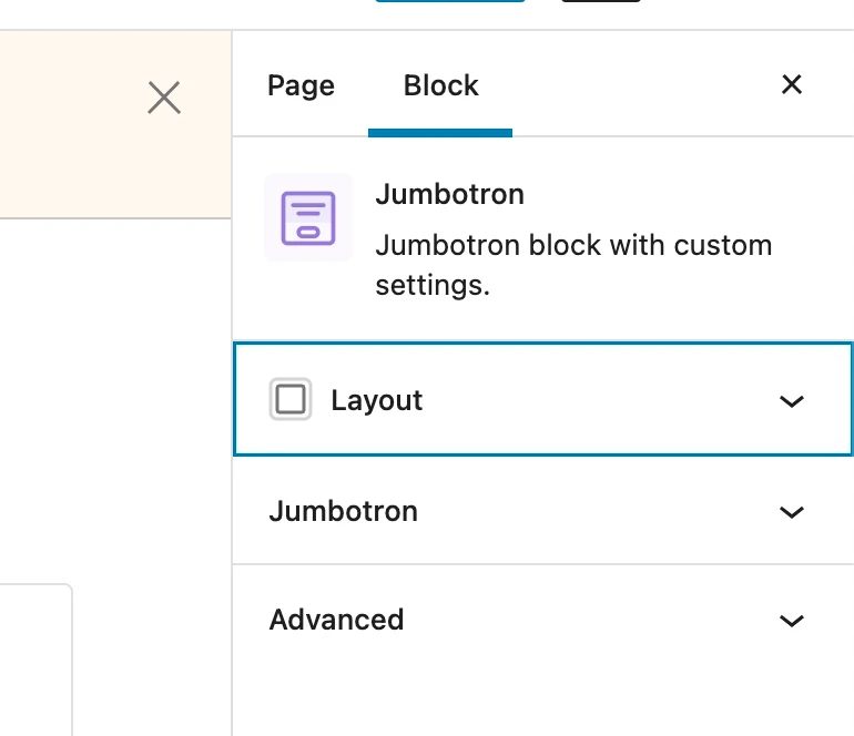
Where can I find wrapper options?
When you open your block editor in the sidebar before every blocks options you will see a layout panel that controls the wrapper options:
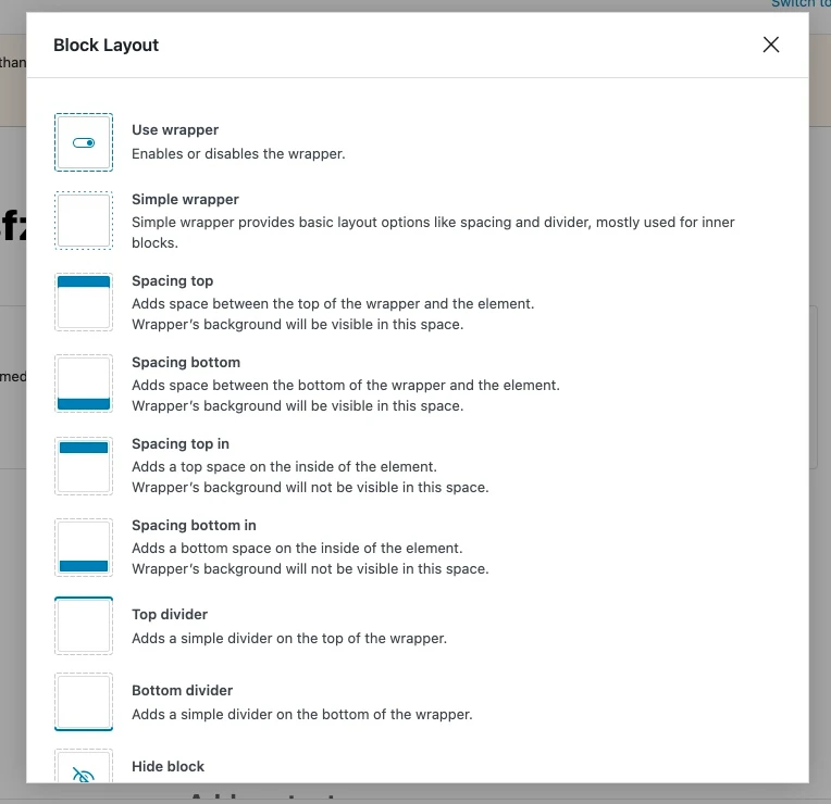
We also made a helper button that describes what each wrapper options does when the layout panel is open:

Here are some of the descriptions that we created but you can add your own icons and options to this modal by providing the additions properties to the HelpModal component:
Additional development options
Along with the provided details and descriptions for the standard options in the HelpModal we have some development specific options for you to check.
wrapperUse
This attribute controls the usage of the wrapper component. It behaves the same way as described in this chapter.
wrapperUseShowControl
This attribute controls whether you will see the options for block use in the block editor. It behaves the same way as described in this chapter.
wrapperUseSimple
We wrapped some options in a specific condition and we call it wrapperUseSimple. In general, this attribute is set to true when you only want the simplified options on your block. Natively, it is used inside all the inner blocks in the column block because we don't need wrappers inside wrappers inside wrappers (and so on). It's a good rule of thumb to use a simple wrapper in all the inner blocks.
wrapperUseSimpleShowControl
This attribute controls whether you are going to see options in the block editor to use the simple option. It behaves the same way as described in this chapter.
wrapperDisable
This attribute disables the wrapper completely. When this attribute is set to true, you will not have any wrapper options in your block.
wrapperParentClass
This attribute is interesting to use if, for example, you have a carousel block with inner blocks. To provide the markup necessary for the carousel script to work, you need to add some items selector (a div). With this key, you can pass a parent item class, and all of your items will be wrapped with this selector and a class.
Wrapper limitations
In wrapper you can't use components key in the manifest to automaticity add additional components like you can in the blocks or components. If you want to add component to a wrapper you must manually add it the old fashion way.