Component in a Block
Blocks and components work perfectly together because they are made that way. We simplified this as much as possible but there always a few things you need to do manually.
Try to think of your development process in this way:
- Each component must be standalone and ideally not depend on any other components (sometimes this is not possible but keep this to a minimum).
- Components must not be aware of the layout they are used in.
- No global styles. Instead, all styles should be contained to the block/component. For more details, check this link.
- You should define all heading variations in a
headingcomponent. You can then use this component everywhere you have a heading instead of writing a new implementation. In practice: don't do<h2>$heading</h2>but render theheadingcomponent instead using the helpers defined in the helpers section. The heading is just an example, but this applies to every component. - You can have multiple heading components in one block.
- JavaScript and PHP part of the block/component must be 99% the same this is why we wrote all those helpers.
Manifest setup
In order to use our way of passing props, there are a few prerequisites you must follow. You must use our helpers and you must set components key in the manifest.
As we described in the block manifest chapter each block/component can have a components key. This key is used in the registration of the block attributes in the block editor and as a dependency tree for passing props in the children components.
Default setup:
"components": {
	"heading": "heading"
}
Components key is an object that can have multiple items added.
Key represents the name that is going to be used for this component in this block/component and the prefix used in the attributes (more on this later).
Value represents the real component name that you have in your project.
Each key and value names can be written in the kebab-case or camelCase but we recommend using camelCase.
Multiple components setup:
"components": {
	"heading": "heading",
	"paragraph": "paragraph"
}
This block/component uses two components, one is heading and the other is paragraph and they are using the default names.
Multiple components set up with the components of the same type:
"components": {
	"heading": "heading",
	"intro": "heading",
	"paragraph": "paragraph"
}
This block/component uses three components, two headings (one of which is renamed to intro) and a paragraph.
Important helpers
As we described earlier, in order to use our setup you must use our helpers. Here are some of the helpers you should get familiar with:
- props - JS - PHP
- getOptions - JS
- getOption - JS
- getAttrKey - JS - PHP
- checkAttr - JS - PHP
- render - PHP
- renderPartial - PHP
For more details please check our helpers sections for JavaScript and PHP.
You can always ignore our setup and use the React way of passing props to components by prop drilling.
Setting up attributes
Each attribute must have the component name prefix in each attribute. This is one of the biggest requirements in order for our setup to work.
By defining components key in the block registration phase we are drilling down from block to the last component and setting up attribute names according to your setup. In order for everything to work, we had to add/change prefixes to each component attribute in relation to where this attribute is used in the dependency tree. It is not so hard as it sounds so let us show you some graphical examples:
I want to use one heading component in my block.
If you have a heading component with these attributes:
src/Blocks/components/heading/manifest.json
"componentName": "heading",
"attributes": {
	"headingContent": {
		"type": "string"
	},
	"headingLevel": {
		"type": "integer",
		"default": 2
	},
	"headingSize": {
		"type": "string",
		"default": "default"
	},
}
and you want to use the heading component in the Jumbotron block, you can use it by adding a component key in the Jumbotron block manifest like this:
src/Blocks/custom/jumbotron/manifest.json
"blockName": "jumbotron",
"attributes": {
	"jumbotronContent": {
		"type": "string"
		"default": "test",
	}
},
"components": {
	"heading": "heading"
}
in your block attribute's object, you will now have these keys:
// Attributes from the component.
"jumbotronHeadingContent": "",
"jumbotronHeadingLevel": 2,
"jumbotronHeadingSize": "default",

// Attributes from the block.
"jumbotronContent": "test",
As you can see in the example, each block/component attribute must have a prefix, and we are then stacking that prefixed in the final output.
I want to override one heading attribute in my block.
We build all our attributes by merging attribute's objects in this order:
- global attributes (global settings)
- wrapper attributes
- component attributes
- block attributes
By following the basic principle of merging objects, if you have two keys with the same name, the last one will always override the previous. Now that you know how attributes are built, you can follow this example for your answer.
We are using the same component as before:
src/Blocks/components/heading/manifest.json
"componentName": "heading",
"attributes": {
	"headingContent": {
		"type": "string"
	},
	"headingLevel": {
		"type": "integer",
		"default": 2
	},
	"headingSize": {
		"type": "string",
		"default": "default"
	},
}
and in Jumbotron block we want to change the default value of headingSize to big:
src/Blocks/custom/jumbotron/manifest.json
"blockName": "jumbotron",
"attributes": {
	"jumbotronContent": {
		"type": "string"
		"default": "test",
	},
	"jumbotronHeadingSize": {
		"type": "string",
		"default": "big"
	},
},
"components": {
	"heading": "heading"
}
In your block attributes object, you will now have these keys:
// Attributes from the component.
"jumbotronHeadingContent": "",
"jumbotronHeadingLevel": 2,
"jumbotronHeadingSize": "big",

// Attributes from the block.
"jumbotronContent": "test",
As you can see in the example, to override the component attribute you just set that attribute to a different value but you must respect the attribute prefix.
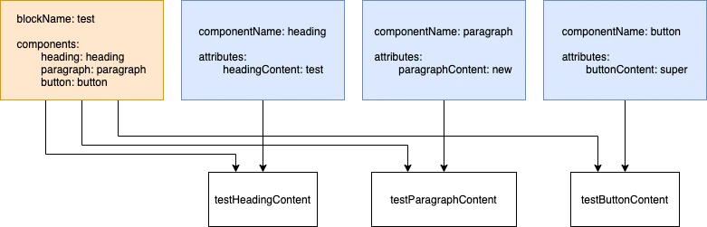
I want to use one heading and a paragraph component in my block.
You can do this by following the same principle as before. Here is an example:
src/Blocks/custom/jumbotron/manifest.json
"blockName": "jumbotron",
"attributes": {
	"jumbotronContent": {
		"type": "string"
		"default": "test",
	}
},
"components": {
	"heading": "heading",
	"paragraph": "paragraph"
}
I want two heading components in my block.
If you want to use multiple heading components in your block, follow this example:
src/Blocks/custom/jumbotron/manifest.json
"blockName": "jumbotron",
"attributes": {
	"jumbotronContent": {
		"type": "string"
		"default": "test",
	}
},
"components": {
	"heading": "heading"
	"intro": "heading"
}
In your block attributes object, you will now have these keys:
// Attributes from the first component.
"jumbotronHeadingContent": "",
"jumbotronHeadingLevel": 2,
"jumbotronHeadingSize": "default",

// Attributes from the second component.
"jumbotronIntroContent": "",
"jumbotronIntroLevel": 2,
"jumbotronIntroSize": "default",

// Attributes from the block.
"jumbotronContent": "test",
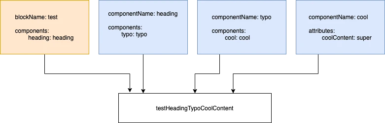
I want to use a component that uses more components (componentCeption).
For example, if you have a block called cards grid that uses a card component, that card component uses a heading component.
Structure:
- Cards
- Card
- Heading
- Card
If you have a heading component with these attributes:
src/Blocks/components/heading/manifest.json
"componentName": "heading",
"attributes": {
	"headingContent": {
		"type": "string"
	},
	"headingLevel": {
		"type": "integer",
		"default": 2
	},
	"headingSize": {
		"type": "string",
		"default": "default"
	},
}
and you have a card component:
src/Blocks/components/card/manifest.json
"componentName": "card",
"attributes": {
	"cardUsage": {
		"type": "boolean"
		"default": true,
	},
},
"components": {
	"heading": "heading"
}
and you have a cards grid block:
src/Blocks/custom/cards-grid/manifest.json
"blockName": "cards-grid",
"attributes": {
	"cardsGridContent": {
		"type": "string"
		"default": "test",
	},
},
"components": {
	"card": "card"
}
in your block attributes object, you will now have these keys:
// Attributes from the heading component.
"cardsGridCardHeadingContent": "",
"cardsGridCardHeadingLevel": 2,
"cardsGridCardHeadingSize": "default",

// Attributes from the card component.
"cardsGridCardUsage": true,

// Attributes from the block.
"cardsGridContent": "test",
As you can see in the example, you have all the attributes from the card and heading component inside your card's grid block.
I don't need all the component options in my block.
All our components come with a few common attributes that we recommend you also implement in your components. One of those attributes is buttonUse.
"buttonUse": true,
This attribute is available in all three components (editor, toolbar, options). If set to false, it will remove this component from the DOM. This is useful if you want to hide all markup from the DOM.
For example, you have a Jumbotron block and a heading that you want to populate if necessary. If you add content to the heading, everything looks good. But if you don't add it, you'll still see a placeholder for that heading in the block editor. This affects how you perceive it, and an editor may think this block will look like that on the front end (with the placeholder text). So if you have a component that you will not populate on some block, switch the toggle to false, and you will hide it from the DOM. This is useful for content editors.
I don't want my editor to be able to change component options in my block.
Another attribute that you can use is buttonShowControls.
"buttonShowControls": true,
This attribute is available in the options component only. You can't set it up via block editor, only from code. You would use it if you wanted to use a heading component and set all the defaults, without your content editor changing how the heading looks. It can add the heading content from the editor section without changing any of the options. You can set this option in the manifest or pass it manually via props.
How do my example attributes behave when I use components in blocks?
Exactly the same way as attributes.
I have a component name that has multiple strings in a name, will this work?
By multiple strings in a name we mean that component name has multiple words, for example, jumbotron-cta. The problem here is that we define components with kebab-case and attributes with camelCase.
The short answer is yes this will work.
I have a component that I want to use manually
We created this cool way of importing attributes and loading components in your blocks or other components. However, that doesn't mean that you can't have instances where you have to load components manually. In that case, you have to provide all the attributes that you want to use manually. The attributes that you didn't provide will not be magically set from the manifest, but you can make your life easier and map it like this.
For example, you have a card component that you will use in the featured-posts block.
src/Blocks/custom/featured-posts/featured-posts.php
echo Components::render(
    'card',
    Components::props('card', $attributes, [
        'cardHeadingContent' => __('Custom content for heading', 'textdomain'),
        'cardParagraphContent' => __('Custom content for paragraph', 'textdomain'),
    ])
);
This example will only pass these 2 attributes to you component and attributes from the currect file, it will not pass default attributes of heading and paragraph components.
By providing the forth parameter to a render method you can also add default attributes to the output like this:
featured-posts.php
echo Components::render(
    'card',
    Components::props('card', $attributes, [
        'cardHeadingContent' => __('Custom content for heading', 'textdomain'),
        'cardParagraphContent' => __('Custom content for paragraph', 'textdomain'),
    ]),
    '',
    true
);
I want to limit which options are shown for components inside a block/component
Let's say you have a block that has a heading component inside it.
The heading has 10 text sizes and 5 colors, but for that block, only 2 colors and 3 text sizes are allowed.
To achieve this you must prepare your component to be able to use this feature:
- Your component options must be named the same name as their attribute value. In the example, you can see that the options key for
typographySizeis the same name as in the attributes.
src/Blocks/components/heading/manifest.json
{
	"componentName": "heading",
	"attributes": {
		"headingSize": {
			"type": "string",
			"default": "16-text-roman"
		},
		"headingColor": {
			"type": "string",
			"default": "black",
			"variable": true,
			"color": true
		},
	},
	"options": {
		"headingSize": [
			{
				"label": "180 Display",
				"value": "180-default"
			},
			{
				"label": "120 Display",
				"value": "120-default"
			},
			{
				"label": "80 Display",
				"value": "80-default"
			},
			{
				"label": "52 Display",
				"value": "52-default"
			},
			{
				"label": "36 Text",
				"value": "36-text"
			}
		],
		"headingColor": [
			"black",
			"white",
			"grey100",
			"grey200"
		]
	}
}
- Every option in your component must use
getOptionhelper for the prop that is used to provide options. Details about the helper can be found here.
SelectControl Example:
const headingSize = checkAttr('headingSize', attributes, manifest);

<SelectControl
	label={__('Text size', 'eightshift-boilerplate')}
	value={headingSize}
	options={getOption('headingSize', attributes, manifest)}
	onChange={(value) => setAttributes({ [getAttrKey('headingSize', attributes, manifest)]: value })}
/>
ColorPaletteCustom Example:
const headingColor = checkAttr('headingColor', attributes, manifest);

<ColorPaletteCustom
	label={__('Color', 'eightshift-boilerplate')}
	value={headingColor}
	colors={getOption('headingColor', attributes, manifest, true)}
	onChange={(value) => setAttributes({ [getAttrKey('headingColor', attributes, manifest)]: value })}
/>
- In the component/block for which you are going to override the options, you must provide an option prop that is going to override the default one also following the described attribute prefixes.
heading-options.js
<HeadingOptions
	{...props('heading', attributes, {
		options: getOptions(attributes, manifest),
	})}
/>
- In the component/blocks for which you are going to override options, you must provide the override in the
manifest.jsonby following the same naming as in the component.
src/Blocks/custom/heading/manifest.json
{
	"blockName": "heading",
	"options": {
		"headingHeadingSize": [
			"80-default",
			"52-default"
		],
		"headingHeadingColor": [
			"black",
			"white"
		]
	}
}
And this is it. You are now able to override the options from the parent block/component.
Keep in mind that you can only override SelectControl, ColorPaletteCustom, and AlignmentToolbar.
I want to only pass attributes to the component that I'm going to use
At one point in time, we agreed on naming standards for all component attributes. That way we made sure that you wouldn't get any collisions when using multiple components. So we said it is ok to spread all attributes to the component and let the component handle what it needs. Well, that approach is ok but it can bite you in the a.. at the point that you least expect.
That is why we created props helper that determines what attributes are passed to what component depending on the dependency tree.
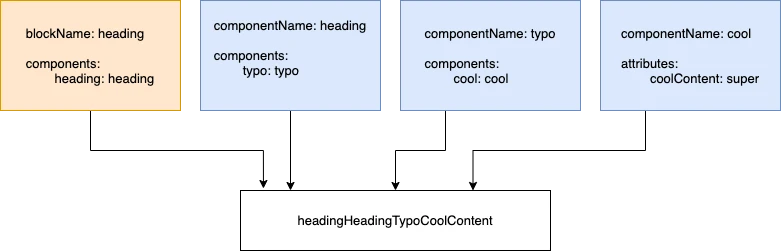
Let's set a layout for this example:
- components
- heading
- typography
- custom
- heading
You have block heading that uses component heading and that component uses another component called typography.
We are putting only relevant code in the example:
src/Blocks/custom/heading/manifest.json
{
	"blockName": "heading",
	"components": {
		"heading": "heading"
	},
}
In the components key, you must provide components that you are going to be using in this block. There are more options in the example at the beginning of this chapter.
src/Blocks/custom/heading/components/heading-editor.js
import React from 'react';
import { props } from '@eightshift/frontend-libs/scripts';
import { HeadingEditor as HeadingEditorComponent } from '../../../components/heading/components/heading-editor';

export const HeadingEditor = ({ attributes, setAttributes }) => {
	return (
		<HeadingEditorComponent
			{...props('heading', attributes, {
				setAttributes: setAttributes,
			})}
		/>
	);
};
In JavaScript, you spread the results of the props helper.
The PHP template should look like this:
src/Blocks/custom/heading/heading.php
<?php

/**
 * Template for the Heading Block view.
 *
 * @package EightshiftBoilerplate
 */

use EightshiftBoilerplateVendor\EightshiftLibs\Helpers\Components;

?>

<div>
	<?php
	echo Components::render(
		'heading',
		Components::props('heading', $attributes)
	);
	?>
</div>
Now, let's see how the component heading looks like.
src/Blocks/components/heading/manifest.json
{
	"componentName": "heading",
	"components": {
		"heading": "typography"
	},
}
In the heading component we are using the typography component but we are not using the default component name. Instead, we are changing the attribute name from typography to heading.
src/Blocks/components/heading/components/heading-editor.js
The same is for options or toolbar components!
import React from 'react';
import { props } from '@eightshift/frontend-libs/scripts';
import { TypographyEditor } from './../../typography/components/typography-editor';
import manifest from './../manifest.json';

export const HeadingEditor = (attributes) => {
	const {
		componentClass,
	} = manifest;

	const {
		blockClass,
	} = attributes;

	return (
		<TypographyEditor
			{...props('heading', attributes, {
				blockClass: componentClass,
			})}
		/>
	);
};
In this example, you can see that everything is the same as in the parent block.
src/Blocks/components/heading/heading.php
<?php

/**
 * Template for the Heading Component.
 *
 * @package EightshiftBoilerplate
 */

use EightshiftBoilerplateVendor\EightshiftLibs\Helpers\Components;

$manifest = Components::getManifest(__DIR__);

$componentClass = $manifest['componentClass'] ?? '';

echo Components::render(
	'typography',
	Components::props('heading', $attributes, [
		'blockClass' => $componentClass
	])
),
The PHP part looks similar to the JS block part.
Typography
There is nothing special that you need to do in the last component in the tree other than following the attributes naming convention.
Summing it all up
Block:
Componentskey in themanifest.jsonis used to provide/change the attribute names on the block registration process.Props helperwill provide all the attributes used in the block and it will follow the dependency tree to the end so that all the attributes from the children components will also be provided as a result.
Components:
Componentskey in themanifest.jsonis used to determine the dependency tree when passing the attributes from parent to children.Props helperwill provide only those attributes that are used in the children's components recursively. The same as props helper in the block.
For more details please read the props helper docs.
Avoid spreading attributes as props but rather use this helper because it provides only what is used in the component.
Passing setAttributes to components
As we described earlier props helper knows what to pass to a child component but there are some wild cards here. When you are passing props from block to component you must pass setAttributes down as props but if if you are passing props from component to component you don't need to. This is because we added some automatic includes in our props helper that you can check here.
Manually overriding attributes from the code
You can also do this and this is why we created the third parameter in the props helper in order to be able to pass attributes via code and still be able to use automatic attributes prefixes that the props helper provides:
<TypographyEditor
	{...props('typography', attributes, {
		typographyContent: item,
	})}
	disableEdit={true}
/>
typographyContent attribute will follow the naming prefix when passed to a child but the disableEdit will remain the same name in all the children.
Any of the included attributes can be passed as the third parameter here, but they will not be prefixed:
<ImageEditor
	{...props('image', attributes, {
		blockClass: componentClass,
	})}
/>